
In marketing, the difference between interest and action is often only a few words long. A visitor may enjoy a blog post, compare pricing, or scroll through an ad, but none of that creates business value until the person knows what to do next. That next-step instruction is the call to action, usually shortened to CTA. It can look simple on the surface, yet it plays a central role in how websites, emails, landing pages, online stores, and social campaigns turn attention into measurable results.
A strong CTA does more than fill space on a button. It gives direction, reduces hesitation, and connects user intent to a clear outcome. When the message is vague, hidden, or mismatched with the page, people leave without moving forward. When the message is specific and relevant, the same traffic can produce more sign-ups, more inquiries, more downloads, and more sales without changing the entire marketing strategy.
This guide explains the meaning of a call to action in practical terms, shows where CTAs appear, and breaks down real examples you can adapt for different goals. The focus is not on broad marketing theory, but on the craft of writing and placing stronger prompts so readers, leads, and customers understand the next step immediately.
What a Call to Action (CTA) Means in Marketing
A call to action is a direct prompt that tells a person what action to take next. In marketing, that action might be to buy a product, request a quote, subscribe to a newsletter, book a demo, download a guide, start a free trial, or simply learn more. The CTA can appear as a button, text link, banner, form instruction, pop-up message, or short line at the end of a piece of content.
The main purpose of a CTA is simple: it moves people from passive attention to active response. Marketing content can build awareness and interest, but the CTA converts that interest into a measurable step. Without it, users may understand the offer and still do nothing because the next move is not obvious.
A CTA Is Not Just a Button
Many people think a CTA only means the colored button on a page. In reality, the CTA is the instruction itself. A button is only one format. For example, a line such as Download the free checklist at the end of a blog post is a CTA. So is a text link in an email that says Reserve your seat. Even a short product page prompt like Add to cart is a CTA.
This distinction matters because CTA quality is about more than design. A bright button with weak wording is still a weak CTA. Strong performance comes from the combination of message, placement, relevance, and visibility.
How a CTA Differs From General Marketing Copy
Not every persuasive sentence is a CTA. A headline may communicate value. A product description may explain features. A brand statement may express identity. A CTA, by contrast, gives a clear instruction. Compare these lines:
- General copy: Save time managing your customer requests.
- CTA: Start your free trial.
The first line explains a benefit. The second line tells the reader what to do next. Good marketing usually needs both. The value message builds motivation, and the CTA channels that motivation into action.
In other words, a CTA is the bridge between persuasion and conversion. It answers a practical question every visitor has, whether consciously or not: What should I do now?
Why CTAs Matter for Conversions
CTAs matter because people rarely take the next step automatically. Even when interest is real, hesitation is common. Users may be busy, distracted, uncertain, or comparing options. A clear CTA removes guesswork and makes the path forward feel easier. This is one reason strong CTAs can improve click-through rate, lead generation, and final conversions without requiring a full redesign of the campaign.
From a behavior standpoint, CTAs reduce cognitive load. People scanning a page do not want to decode the next move. They respond better when the action is visible, specific, and tied to a benefit. A CTA such as Get the pricing guide is easier to process than a generic button that says Submit or Continue.
CTAs Guide User Decisions
Every page has a job. A homepage may direct visitors to product categories. A landing page may push users toward a form. A blog post may encourage newsletter subscriptions or resource downloads. A product page may move shoppers to checkout. The CTA defines that job in user-facing language.
When there is no clear CTA, people often drift. They may keep browsing without commitment, or leave altogether. That creates a hidden leak in the customer journey. Traffic arrives, but momentum stops because the page does not clearly convert attention into action.
CTAs Support Both Micro and Macro Conversions
Not every CTA needs to ask for the final sale. In fact, many strong marketing systems use different CTAs for different stages of intent. A first-time reader may not be ready to buy, but might be willing to Read the case study or Download the beginner guide. Those smaller steps are often called micro-conversions. They build trust, qualify interest, and move the person closer to a larger action later.
Macro conversions are the big outcomes businesses usually care about most, such as purchases, booked consultations, paid subscriptions, or signed contracts. CTAs help at both levels. They can capture early interest and also close high-intent visitors when the timing is right.
This is why CTA strategy is not just about wording. It is about matching the ask to the reader’s readiness. The better that match, the stronger the conversion path tends to be.
Common Types of CTAs and Where They Appear
CTAs appear in almost every digital touchpoint, but the wording and purpose should change based on the platform. A person reading a blog article behaves differently from someone clicking a product ad or opening a promotional email. The most effective CTA is the one that fits the context.
Website and Landing Page CTAs
On websites, CTAs usually guide visitors toward a primary next step. Common examples include:
- Homepage CTA: Explore services, view pricing, or book a consultation.
- Landing page CTA: Download the guide, start the trial, or request a demo.
- Blog CTA: Join the newsletter, get the template, or read the next article.
- Contact page CTA: Send a message, schedule a call, or ask for a quote.
Landing pages often perform best when one CTA dominates the page. Too many competing actions can weaken focus and split attention.
Email Marketing CTAs
Emails are usually tighter in structure, which makes the CTA even more important. Readers often decide within seconds whether to click or ignore the message. Effective email CTAs tend to be concise and closely tied to the promise in the subject line and body copy. Examples include Claim your discount, Watch the webinar, or Finish your registration.
Because email space is limited, CTA clarity matters more than cleverness. If the reader opens the email because of one benefit but the CTA points to something else, clicks usually drop.
Social Media and Paid Ad CTAs
On social platforms and digital ads, CTAs must work quickly. Attention is short, distractions are constant, and users are usually not in deep research mode. In these settings, good CTAs are direct and low-friction. Examples include Shop now, Learn more, Download now, and See plans.
Short-form platforms also benefit from intent matching. A cold audience may respond better to See how it works than Buy now. A retargeting ad shown to people who already viewed a product might justify a stronger CTA such as Complete your order.
E-commerce and Product Page CTAs
Online stores rely heavily on CTA quality because product pages sit close to purchase decisions. The standard CTA is often Add to cart or Buy now, but support CTAs also matter. Shoppers may need Check availability, Compare sizes, View shipping details, or Save for later before buying.
In e-commerce, CTAs often work as a sequence rather than a single moment. One CTA starts the purchase, another reduces doubt, and another recovers undecided visitors through wishlist or reminder actions.
Strong Call to Action Examples
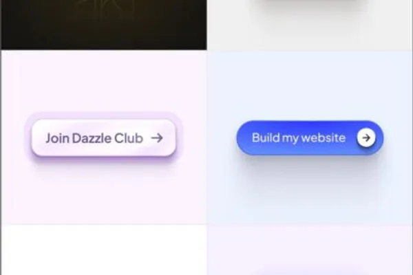
The best CTA examples are specific to the goal, audience, and stage of decision. A button that works for an ecommerce product page may fail on a B2B landing page, and a newsletter CTA may need a softer tone than a checkout CTA. Still, there are reliable patterns that make some calls to action stronger than others.
Weak vs Strong CTA Wording
One of the simplest ways to improve a CTA is to replace vague words with clear action plus value. Here are practical comparisons:
- Weak: Submit
Stronger: Get My Free Quote - Weak: Click Here
Stronger: View Pricing Plans - Weak: Learn More
Stronger: See How the Platform Works - Weak: Download
Stronger: Download the SEO Checklist - Weak: Sign Up
Stronger: Create Your Free Account
The stronger versions work better because they tell the user what they are getting, not only what they are doing.
CTA Examples by Marketing Goal
Different objectives call for different CTA styles. Here are useful examples grouped by purpose:
- For sales: Buy Now, Add to Cart, Get Yours Today, Start Your Order
- For lead generation: Request a Free Quote, Book a Demo, Talk to an Expert, Schedule a Consultation
- For email growth: Join the Newsletter, Get Weekly Tips, Subscribe for Updates
- For content downloads: Download the Guide, Get the Template, Access the Checklist
- For product discovery: See Features, Compare Plans, Watch the Demo, Explore the Collection
- For event registration: Reserve Your Spot, Save My Seat, Register for the Webinar
These examples show an important principle: effective CTA copy reflects the user’s desired outcome. People rarely want to submit, click, or continue. They want the quote, the template, the demo, the answer, or the product.
CTA Examples by Audience Readiness
You can also improve CTA performance by adjusting the ask to match intent:
- Cold audience: Read the guide, see how it works, discover the benefits.
- Warm audience: Compare plans, book a demo, get pricing.
- Hot audience: Start your trial, buy now, complete your purchase.
This progression matters because the strongest CTA is not always the most aggressive one. If the audience is still learning, a pushy CTA can feel premature. If the audience is already convinced, a soft CTA can slow the sale.
Examples for Different Business Models
A software company may use Start Free Trial or Book a Demo. A consultant may use Schedule a Strategy Call. An online course creator may use Enroll Today. A local service business may use Get a Free Estimate. A media brand may use Join the Newsletter or Read the Full Guide.
The wording changes because the value exchange changes. That is why copying another brand’s CTA without considering your own offer rarely works as well as expected.
What Makes a CTA Effective
An effective CTA combines strong language with strong context. It is not only about writing one impressive phrase. The best calls to action succeed because several elements support each other at the same time.
Clear Action Verbs
Good CTAs begin with verbs that make the next step obvious. Words like get, start, book, download, join, and explore create momentum. They are more useful than empty verbs such as submit or proceed, which describe the interface more than the outcome.
Specific Value
A CTA becomes stronger when it tells users what they receive. Download the guide is better than Download now. Get your free quote is better than Contact us. Specificity reduces uncertainty and helps the reader predict the benefit before clicking.
Relevance to User Intent
The CTA should fit the reason the person came to the page. If a blog post teaches a concept, a CTA for a related template or newsletter may feel natural. If a product page is clearly commercial, a purchase CTA makes sense. Relevance matters because even well-written CTAs fail when they interrupt the user’s mindset instead of supporting it.
Low Friction
Every CTA creates a small psychological cost. The user wonders how long it will take, whether payment is required, whether spam will follow, or whether the step is reversible. Good CTAs often reduce friction by adding reassurance near the action. Examples include No credit card required, Takes 2 minutes, or Cancel anytime. These details are not always part of the button text itself, but they strengthen the CTA as a conversion element.
Visibility and Visual Priority
Even strong wording can fail if the CTA is hard to find. Effective CTAs are placed where attention naturally lands and are visually distinct from less important elements. This does not always require bright colors or oversized buttons. It requires contrast, whitespace, logical placement, and a clear hierarchy so the main action stands out from secondary links.
Credibility and Promise Match
Users click when they trust the outcome. If the CTA promises one thing and the destination delivers another, confidence drops fast. A button that says Get the free report should lead directly to that report or the short form required to access it. The tighter the promise match, the better the user experience and the higher the chance of conversion.
Practical Tips for Writing Better CTAs
Writing better CTAs is part copywriting, part customer understanding, and part page strategy. The most useful improvements usually come from simplifying the message and aligning it with user intent rather than trying to sound clever.
Start With the Desired Outcome
Before writing the CTA, define the exact action you want and why the user would care. Ask two practical questions:
- What action should the reader take next?
- What value will they believe they are getting from that step?
If you cannot answer both clearly, the CTA will probably feel weak on the page.
Use a Simple Formula
A reliable structure is verb + value. For example:
- Download the template
- Book your demo
- Get the pricing guide
- Start your free trial
Another useful formula is verb + outcome, such as Start saving time or Find your plan. These formulas keep the copy direct while still expressing a benefit.
Match the CTA to the Page
The CTA should feel like a natural next step from the content above it. If the page explains beginner information, a hard sell may feel abrupt. If the page includes pricing, testimonials, and product details, the CTA can be more transactional. Good alignment makes the click feel like a continuation, not a jump.
Reduce Unnecessary Friction
Some users hesitate because they fear complexity. You can ease that friction by refining both the CTA and the supporting copy. Practical examples include:
- Replace Request Information with Get a Free Quote.
- Add reassurance such as No obligation near consultation CTAs.
- Use Start Free Trial instead of Buy Now when commitment is still high.
- Tell users what happens after the click, especially for forms.
Small clarifications often improve confidence more than dramatic redesigns.
Consider First-Person CTA Copy
Some brands test first-person wording such as Start My Free Trial or Reserve My Seat. This style can feel more personal and action-oriented because it helps the reader imagine ownership of the next step. It is not automatically better in every case, but it is worth testing when your offer is personal, aspirational, or subscription-based.
Limit Competing Actions
When a page asks the user to do five different things, none of them feels important. Decide on one primary CTA and support it with only a few secondary actions if necessary. This is especially important on landing pages, product pages, and conversion-focused blog posts.
Write for Real People, Not Internal Teams
Many weak CTAs come from internal language rather than customer language. Businesses say things like Submit ticket, Initiate onboarding, or Access portal. Users usually respond better to simpler phrasing such as Get support, Start setup, or Sign in to your account. The more natural the wording, the less effort the click requires.
Use Context Around the CTA
The button is important, but nearby copy also matters. A short line above or below the CTA can explain the benefit, remove doubt, or set expectations. For example, a webinar CTA becomes stronger when paired with a brief note such as Free 30-minute session with live Q&A. The button carries the action, while the supporting text strengthens motivation.
Common CTA Mistakes to Avoid
Even experienced marketers weaken conversions with avoidable CTA mistakes. Most of them come from ambiguity, clutter, or mismatch between the message and the landing experience.
Using Generic Wording
Buttons like Click Here, Submit, and Read More are common because they are easy to write, but they often miss the chance to communicate value. Generic wording forces the user to infer the benefit instead of stating it clearly.
Asking for Too Much Too Soon
If the audience is not ready, a hard CTA can create resistance. A first-time visitor reading an educational article may not respond to Buy Now, but might respond well to Get the Free Guide or See How It Works. Strong CTA strategy respects the stage of awareness.
Presenting Too Many Equal CTAs
When everything is highlighted, nothing stands out. A page with multiple buttons in the same color, size, and position can confuse users about the priority action. Decide what matters most and design around that decision.
Hiding the CTA
Sometimes the wording is good but placement is poor. If the CTA appears too late, blends into the layout, or sits far from the relevant copy, users may miss it. Visibility is part of clarity.
Breaking the Promise After the Click
A CTA should lead to a page or step that matches the expectation it created. If a button says Download the guide but opens a long sales process, users feel misled. That hurts trust and often reduces future conversions as well.
Relying on Urgency Without Substance
Urgency can help, but fake urgency weakens credibility. Phrases like Act now or Limited time only work when they are truthful and relevant. If every page sounds urgent without a real reason, users learn to ignore it.
How to Test and Improve CTA Performance
CTA improvement should not depend on guesswork alone. Once your call to action is live, you can test and refine it using real performance data. This is where good marketing becomes more disciplined. Small changes in wording, placement, or surrounding copy can create meaningful gains when measured properly.
Track the Right Metrics
Start by deciding what success looks like. A CTA can be measured by different metrics depending on its role:
- Click-through rate: How many people clicked the CTA.
- Conversion rate: How many completed the next step after clicking.
- Form completion rate: How many finished the form or sign-up process.
- Revenue per visitor: Useful for ecommerce and transactional pages.
A CTA that gets more clicks is not always better if those clicks produce fewer completed conversions. Measure the full path, not only the first interaction.
Run Simple A/B Tests
A practical way to improve CTA performance is to test one variable at a time. Useful variables include:
- Button copy
- Placement on the page
- Primary color or contrast
- Supporting reassurance text
- First-person versus second-person wording
- Short CTA versus benefit-focused CTA
Testing one major change at a time makes the result easier to interpret. If you change five things at once, you may see movement without knowing what caused it.
Look Beyond the Button
Sometimes a weak CTA is actually a page problem. If the offer is unclear, trust signals are missing, or the form feels too long, changing the button text alone may not help much. Review the entire conversion experience, including headlines, proof points, page speed, mobile usability, and the amount of information required from the user.
This is especially important for lead generation pages. A strong CTA cannot fully compensate for a poor value proposition or a confusing form.
Segment by Traffic Source and Device
CTA behavior often changes by audience segment. Visitors from search may prefer information-first CTAs because they are still researching. Visitors from branded email campaigns may be more ready to convert. Mobile users may also react differently from desktop users because screen space is tighter and scanning behavior is faster.
Segmenting performance helps you avoid false conclusions. One CTA may look average overall while working extremely well for a valuable audience segment.
Build an Ongoing CTA Improvement Habit
You do not need a massive optimization program to make progress. A simple cycle works well:
- Choose one high-traffic page or campaign.
- Identify the main CTA and current baseline metrics.
- Write one clearer or more relevant alternative.
- Test the change long enough to gather useful data.
- Keep the winner and repeat with the next improvement.
Over time, this disciplined approach creates better conversion paths across the entire marketing system. CTA optimization is often cumulative. Many small gains across multiple pages can outperform one large redesign.
Conclusion
A call to action is one of the smallest pieces of marketing copy, but it carries disproportionate weight. It tells people what to do next, reduces hesitation, and connects attention to measurable business results. Whether the goal is a sale, a sign-up, a consultation, or a content download, the CTA works best when it is clear, relevant, visible, and aligned with user intent.
If you want better performance, start by reviewing the CTAs already on your site, emails, ads, and landing pages. Replace vague wording with specific value, reduce friction around the click, and test improvements methodically. In many cases, stronger CTA writing is one of the fastest ways to turn existing traffic into more meaningful action.
