
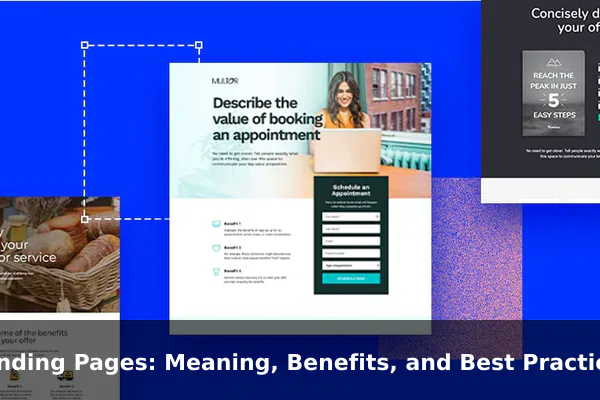
Landing pages sit at the point where attention either turns into action or disappears. A paid ad, email link, search result, or social promotion can generate visits, but visits alone do not create leads, sales, or qualified prospects. What happens after the click often determines whether a campaign produces real business value.
That is why landing pages matter in modern marketing. Unlike broad website pages built to serve many types of visitors, a landing page is created around one offer, one audience, and one next step. It removes unnecessary choices, sharpens the message, and gives people a clear reason to act instead of browse aimlessly.
This guide explains what landing pages mean, how they differ from homepages and other web pages, why they can improve conversion performance, and which best practices help them work better. If you want more sign-ups, demo requests, downloads, registrations, or purchases, understanding how landing pages function is one of the most practical skills you can build.
What a Landing Page Means in Marketing
In marketing, a landing page is a standalone web page designed for a specific campaign goal. People usually arrive there after clicking a link from an ad, email, social media post, partner promotion, QR code, or other targeted source. The page exists to guide the visitor toward one focused action, such as filling out a form, booking a call, claiming an offer, or completing a purchase.
The core definition
A landing page is not simply any page where someone lands. In everyday analytics language, that phrase can describe the first page of a session. In marketing practice, however, the term usually refers to a purpose-built page created to support conversions. Its job is not to explain every part of the business. Its job is to move a specific visitor from interest to action.
That difference matters because many websites confuse general information pages with conversion pages. A company might send traffic to a homepage, service page, or product category page and wonder why results are weak. Often the issue is not traffic volume but lack of focus. Visitors arrive with one expectation, see too many options, and leave without taking the desired step.
The purpose behind the page
The primary purpose of a landing page is to create a strong post-click experience. The message someone sees before the click should continue smoothly after the click. If an ad promises a free template, the landing page should immediately present that template. If an email promotes a webinar, the landing page should make registration easy and obvious. The tighter the connection between source message and landing page content, the more natural the conversion feels.
In that sense, landing pages act like bridges between traffic sources and business goals. They align audience intent, campaign messaging, page design, and call to action. When those pieces fit together, the page feels relevant. When they do not, even a well-designed page can underperform.
What counts as a conversion
A conversion is the action the marketer wants the visitor to take. On some landing pages that means a sale. On others it could mean submitting an inquiry form, downloading a guide, starting a trial, joining a waitlist, registering for an event, or requesting a quote. The page should make that goal unmistakable.
Strong landing pages are built around one primary conversion. They may support that goal with proof, benefits, testimonials, and FAQs, but the structure always points back to a single outcome. That single-purpose design is what makes landing pages so useful in performance-focused marketing.
How Landing Pages Differ From Homepages and Other Web Pages
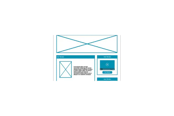
Many businesses already have a website, so it is reasonable to ask why a landing page is needed at all. The answer is that homepages and general site pages are built for exploration, while landing pages are built for decision-making. They solve different problems.
Different goals and visitor intent
A homepage is usually an entry point for many audiences. It may need to serve new visitors, returning customers, job applicants, investors, partners, and media. Because it must support many goals, it usually offers many paths. A landing page does the opposite. It assumes a narrower audience and focuses on one outcome.
For example, a homepage might say who the company is, what it sells, where to find support, and which resources to read. A landing page for a free demo does not need all of that. It needs a persuasive case for the demo, proof that the offer is worthwhile, and a clear way to book it.
Different structure and navigation
General website pages often include full navigation menus, multiple banners, sidebar links, footer links, and a wide range of content options. That is useful when visitors want to explore. It is less useful when the goal is conversion. Every extra link creates another chance to leave the intended path.
Landing pages usually reduce navigation and competing exits. They keep the layout tighter, the copy more direct, and the action path simpler. That does not mean they should feel empty or manipulative. It means they are intentionally designed to reduce distraction.
Different content depth
Website pages often prioritize broad coverage. A landing page prioritizes relevance. Instead of trying to answer every possible question about the business, it answers the questions most likely to affect the conversion decision:
- What is the offer?
- Why should this visitor care?
- What happens next?
- Why should the visitor trust the brand?
- How easy is it to take action?
This is why landing pages often outperform generic pages in campaigns. They are not better because they are shorter or more stylish by default. They are better because they are more aligned with intent.
Key Benefits of Using Landing Pages
Landing pages are valuable because they bring precision to marketing execution. Instead of sending all traffic to the same destination, marketers can create a tailored experience for each offer, audience segment, or campaign source.
Higher conversion potential
The clearest benefit is stronger conversion potential. A page with one purpose is generally easier for visitors to understand and act on than a page with many competing messages. When the headline, benefits, proof, and call to action all reinforce the same offer, the decision feels simpler.
This does not guarantee high results on its own, but it creates better conditions for performance. Traffic quality still matters. Offer quality still matters. Copy still matters. Even so, a focused landing page gives campaigns a better chance to convert than a broad page designed for many unrelated goals.
Better message match and audience targeting
Different audiences respond to different problems, outcomes, and objections. Landing pages make it easier to speak directly to each segment. A software company might create one page for small businesses, one for agencies, and one for enterprise teams. The product may be the same, but the framing changes.
This kind of specificity improves relevance. A visitor is more likely to act when the page reflects the exact need that brought them there. Instead of reading generic claims, they see language that matches their situation, intent, and level of awareness.
Cleaner tracking and optimization
Landing pages also improve measurement. Because each page is tied to a specific campaign or offer, marketers can track performance more clearly. They can see which sources, messages, and audiences generate leads, and which pages lose people before conversion.
That clarity supports better testing. If one version has a stronger headline, shorter form, or clearer CTA, results will usually reveal it. Optimization becomes less guesswork and more disciplined iteration.
More efficient use of budget
If you are paying for traffic, inefficiency gets expensive quickly. Sending ad clicks to a page with weak relevance or poor structure wastes attention and spend. A strong landing page helps make each click more valuable by increasing the chance that a visitor will take the next step.
Over time, even small conversion improvements can have a meaningful effect on cost per lead or cost per acquisition. That is why landing pages are not only design assets. They are budget efficiency tools.
Stronger lead quality and follow-up
When a landing page clearly explains the offer and sets expectations, the people who convert are often better qualified. The form fields, page language, and CTA can all help attract the right audience rather than just more volume. That matters because a page that produces many weak leads may look good on the surface while creating problems downstream for sales or nurturing teams.
- Focused messaging improves clarity and reduces confusion.
- Tailored experiences support different traffic sources and audience segments.
- Simpler paths reduce friction between interest and action.
- Better data makes testing and reporting easier.
- Higher efficiency helps marketers get more value from existing traffic.
Common Types of Landing Pages
Not all landing pages serve the same purpose. The format depends on what the business is offering and what action it wants from the visitor. Knowing the main types helps marketers choose the right structure instead of copying a page style that does not fit the goal.
Lead capture pages
Lead capture pages are built to collect visitor information, usually through a form. The offer might be a consultation, newsletter, checklist, white paper, quote request, or trial. These pages are common in service businesses, B2B marketing, education, and software.
The key challenge is balance. The page must offer enough value to justify the form while keeping the form easy enough to complete. If the ask feels too large for the perceived benefit, conversion rates drop.
Click-through pages
Click-through pages warm up visitors before they reach a final purchase or sign-up destination. Rather than asking for information immediately, they explain the offer and then send the user onward with a button. This is common in ecommerce, subscription products, and software flows where the user needs a bit more persuasion before the final step.
These pages often focus on benefits, objections, urgency, and visual product context. Their success depends on moving the visitor confidently to the next screen.
Product launch pages
Product launch pages are used when a brand wants to introduce something new, build anticipation, or collect early interest. They may invite users to join a waitlist, claim early access, or pre-order. The best versions combine excitement with clarity. They explain what is new, why it matters, who it is for, and what the visitor should do next.
Event registration pages
Event pages are built around webinars, workshops, conferences, demos, live sessions, or local events. They need to answer practical questions quickly, including topic, date, value, speaker credibility, and registration process. If the event is online, the page should also explain how attendance works and what participants can expect.
Download and resource pages
These pages promote downloadable assets such as templates, guides, case studies, calculators, sample packs, or research summaries. They work well when the resource solves a specific problem. A vague free download is less compelling than a targeted resource with a concrete outcome.
In practice, many businesses use a mix of these types. The important point is not the label. It is matching the page structure to the conversion goal and the visitor’s stage of intent.
Elements of a High-Performing Landing Page
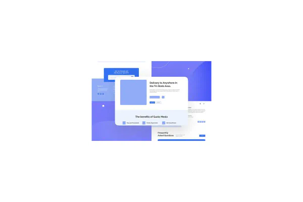
A high-performing landing page is not defined by trendy design or long copy alone. It works because several elements support one another in a coherent sequence. The visitor understands the offer quickly, sees why it matters, feels enough trust to continue, and knows exactly how to act.
A clear headline and supportive subheadline
The headline is usually the first thing visitors notice. It should communicate the offer or outcome in plain language. Clever wording can be memorable, but clarity matters more than creativity when conversion is the goal.
The subheadline should add useful context. It can explain who the offer is for, what problem it solves, or why it is valuable. Together, the headline and subheadline should answer the visitor’s immediate question: is this relevant to me?
Strong benefit-focused copy
People do not convert because a page is full of features. They convert because they understand how the offer helps them. That is why effective landing page copy focuses on outcomes, pain points, ease, speed, clarity, savings, growth, convenience, or risk reduction, depending on the offer.
Feature details still matter, especially in complex products, but benefits should lead. A useful rule is to explain what the thing is, why it matters, and what changes for the visitor if they take action.
Relevant visuals
Images, interface screenshots, diagrams, short videos, or product mockups can improve understanding when they support the message. Visuals should reduce ambiguity, not decorate the page aimlessly. For a software offer, a product screenshot may build confidence. For a course, a preview of materials may help. For a physical product, contextual imagery can show use and scale.
The best visuals feel connected to the offer. Generic stock photos rarely create that effect on their own.
Social proof and trust signals
Visitors often hesitate because they are uncertain. Social proof lowers that uncertainty by showing that other people or organizations found the offer credible and useful. Common trust elements include testimonials, ratings, client logos, user counts, review snippets, certifications, guarantees, secure checkout cues, and concise privacy reassurance.
Trust signals work best when they are specific. A testimonial that describes a real result is stronger than vague praise. A recognizable client logo is stronger than an empty claim of industry trust.
A visible and persuasive call to action
The call to action, or CTA, should be easy to find and easy to understand. It should tell the visitor what happens next, such as Start Free Trial, Get the Guide, Reserve My Seat, or Book a Demo. Generic labels can still work, but specific action language often performs better because it reduces ambiguity.
The CTA should also feel proportionate to the offer. Asking for a sales call on a cold traffic page may create more resistance than offering a lower-commitment step first. Good landing pages respect that balance.
A form that matches the value of the offer
If the page uses a form, every field should earn its place. More fields create more friction. That does not mean forms must always be short. A high-intent buyer requesting a quote may accept a longer form than someone downloading a checklist. The right length depends on the value exchange and how qualified the lead needs to be.
Helpful form design also matters. Clear labels, error handling, privacy cues, and mobile-friendly inputs all improve completion rates.
Fast loading and mobile usability
Many landing pages fail before copy can even do its job because the page loads slowly or becomes awkward on smaller screens. A good mobile experience is no longer optional. Buttons must be easy to tap, text must be readable, forms must be simple to complete, and key content must appear quickly.
Performance and usability are part of persuasion. If the experience feels cumbersome, trust drops and abandonment rises.
Landing Page Best Practices That Improve Results
Best practices are useful when they support the basics rather than distract from them. A landing page does not need to follow every trend. It needs to make the next step feel obvious, relevant, and low-friction.
Maintain strong message match
The message that drove the click should continue on the landing page. If a paid ad promises a free estimate in 24 hours, the page should repeat that promise clearly and immediately. If an email promotes a limited webinar seat offer, the page should confirm the topic and urgency without forcing the visitor to search for them.
This alignment reduces confusion and keeps momentum high. It also improves trust because the visitor feels they arrived in the right place.
Keep one primary CTA
Landing pages perform best when there is one dominant action. Secondary links can exist when necessary, but they should not compete visually with the main goal. If the page asks visitors to buy, subscribe, read a blog, follow social accounts, and contact support all at once, attention gets diluted.
Single-focus design is one of the clearest differences between strong landing pages and cluttered web pages.
Write for scanning first
Most visitors do not read every line in order. They scan headlines, subheads, bullets, buttons, and proof points before deciding whether to slow down. That means structure matters as much as wording. Break copy into sections, keep paragraphs readable, and make the value proposition visible without demanding too much effort.
Strong scanning structure does not mean shallow content. It means the page reveals important information quickly and in the right order.
Reduce friction wherever possible
Friction appears in many forms: unclear copy, long forms, slow loading, weak contrast, hidden pricing, unnecessary fields, confusing layouts, or missing proof. The best landing pages remove obstacles one by one. They make the page feel easier to trust and easier to use.
Reducing friction is often more effective than adding more persuasion. Sometimes the problem is not that visitors need more reasons. It is that the process feels harder than it should.
Test changes systematically
Landing page improvement is rarely a one-time task. The strongest teams test and refine pages over time. That might include headlines, CTA text, form length, page layout, proof elements, or offer framing. Testing matters because even experienced marketers cannot reliably predict every audience response in advance.
- Start with a clear hypothesis based on real behavior or campaign data.
- Change one meaningful variable at a time when possible.
- Measure the result against the primary conversion goal.
- Keep learning from both wins and losses.
Testing works best when it is disciplined. Random design changes without a clear reason create noise instead of improvement.
Common Mistakes to Avoid
Many landing page problems are surprisingly consistent. Businesses often lose results not because the offer is bad, but because the page introduces unnecessary confusion, friction, or distrust.
Weak or vague headlines
If visitors cannot understand the offer quickly, many will leave before reading further. Headlines that sound clever but say little usually underperform clearer alternatives.
Too many links and competing actions
Navigation menus, unrelated banners, and excessive footer options pull attention away from the primary goal. A landing page should guide, not scatter.
Unclear value proposition
Some pages describe what the business does without explaining why the visitor should care right now. A landing page must connect the offer to a real benefit or solved problem.
Forms that ask for too much
Requesting unnecessary details lowers completion rates. If a field does not help qualification or follow-up, it may not belong there.
Poor mobile experience
Buttons that are hard to tap, text that feels cramped, and forms that break on small screens can ruin otherwise good campaigns.
Missing trust cues
If the page asks for information or money without offering proof, reassurance, or credibility, hesitation rises. Trust is not a decoration. It is part of conversion design.
No testing or measurement plan
Publishing a landing page and leaving it untouched is a common mistake. Performance pages need review, measurement, and iteration.
- Avoid generic copy that could fit any company.
- Avoid stock layouts that bury the CTA.
- Avoid sending mixed signals about what happens after conversion.
- Avoid treating design as separate from business intent.
When to Use a Landing Page in Your Marketing Strategy
Landing pages are especially useful when you want tighter control over the post-click experience. They are not necessary for every scenario, but they are highly effective when traffic comes from a specific campaign and the desired action is clear.
Paid advertising campaigns
Landing pages are a natural fit for paid search, paid social, display ads, and sponsored placements because the traffic source is targeted and measurable. Sending paid clicks to a relevant landing page usually creates better continuity than sending them to a broad homepage.
Email promotions
Emails often highlight one offer, event, or resource. A landing page extends that focus by giving recipients a dedicated place to act. This is especially useful for launches, limited-time promotions, downloadable content, and registrations.
Lead magnets and content offers
If you offer templates, checklists, calculators, case studies, or guides, a landing page helps frame the value clearly and capture leads in a more organized way than a general resource page.
Product launches and special campaigns
When a campaign has a distinct angle, audience, or deadline, a landing page makes the message easier to control. Seasonal promotions, new feature rollouts, waitlists, and pre-orders often benefit from standalone pages.
Service businesses and consultations
Consultants, agencies, local businesses, and specialized service providers often use landing pages to support narrow intent, such as quote requests, audit bookings, or location-based offers. These pages can speak directly to the audience’s problem rather than forcing them to sort through an entire site.
There are also times when a landing page is not the best tool. If the visitor needs broad education, product comparison, or extensive browsing before deciding, a fuller website experience may make more sense. The right choice depends on intent, not habit.
How to Measure Whether a Landing Page Is Working
A landing page should not be judged by appearance alone. The real question is whether it moves qualified visitors toward the intended outcome. That requires measurement that connects page behavior to business value.
Track the primary conversion rate
The most important metric is usually the percentage of visitors who complete the main action. This reveals whether the page is doing its central job. If the conversion rate is weak, the issue could involve traffic quality, offer relevance, page clarity, trust, or friction.
Look beyond raw volume
More leads are not automatically better leads. A page that collects many low-intent submissions may burden the next stage of the process. Measure lead quality, show-up rates, sales acceptance, or downstream revenue where possible.
Review engagement signals carefully
Bounce rate, scroll depth, time on page, button clicks, and form abandonment can all provide useful clues, but they are supporting metrics rather than final goals. A page can have low time on page and still perform well if the offer is simple and the CTA is strong.
Compare variants and traffic sources
Performance often changes based on audience and source. A page that works for branded search traffic may struggle with cold social traffic. That is why segmentation matters. Break results down by channel, campaign, device, and audience when possible.
The best measurement mindset is practical: identify the bottleneck, test the right change, and judge success by whether the page creates better business outcomes, not just prettier reports.
Conclusion
Landing pages matter because they bring focus to marketing. They help businesses translate campaign attention into measurable action by aligning the message, audience, offer, and next step. When done well, they reduce distraction, improve clarity, and create a stronger path from click to conversion.
The strongest landing pages are not built around hype. They are built around relevance. A clear promise, a persuasive structure, visible trust, a logical CTA, and a smooth user experience usually outperform clutter and guesswork. If you treat a landing page as a deliberate conversion tool rather than just another web page, it becomes one of the most effective assets in your marketing system.
